
Data Visualization Services: Turn Complex Data into Clear Decisions
- 8 min read
Highlights
- Data visualization transforms complex data into understandable visuals, helping organizations interpret and act on performance metrics effectively.
- Data visualization is now a strategic necessity, allowing real-time performance insight and promoting team alignment around metrics.
- Effective visualization is about clear communication rather than visual complexity, with colors and layout guiding data interpretation.
- AI plays a vital role in modern data visualization by highlighting critical insights, identifying trends, and predicting outcomes.
- Data visualization creates visibility for marketing strategies, member engagement, fundraising outcomes, team alignment, and accountability.
Organizations today operate in an environment where data is constantly being generated. Marketing platforms capture campaign performance. Websites record user behavior. Customer relationship systems track sales and engagement. Finance platforms measure revenue, forecasting, and operational efficiency. Every department collects metrics that promise insight.
The challenge is rarely a shortage of information. The challenge is turning that information into understanding.
Leaders often face dashboards filled with numbers but still struggle to answer fundamental questions.
Which campaigns are truly driving growth?
Which audiences are responding most strongly?
Where are resources producing the greatest return?
Without clear interpretation, even the most sophisticated data systems can leave decision makers uncertain.
This is where data visualization services become essential. By transforming raw data into clear visual experiences, organizations gain the ability to interpret performance quickly, communicate insights effectively, and act with confidence. A well-designed visualization reduces complexity and allows patterns, trends, and opportunities to emerge immediately.
When executed well, data visualization turns numbers into a story that leaders can understand and use.
Why Data Visualization Is Now a Strategic Capability
In the past, data analysis was often limited to analysts working in spreadsheets or static reports that were distributed periodically. Today, the speed of business requires faster interpretation and shared visibility across teams.
Marketing teams need real-time insight into campaign performance. Associations want to monitor membership trends and engagement. Nonprofit organizations track fundraising outcomes and donor activity. Government agencies evaluate program effectiveness across multiple regions and populations.
Raw tables of numbers cannot meet these needs. Humans interpret visual information far faster than text or numerical lists. When data is presented visually, the brain recognizes patterns almost instantly.
This is why effective data visualization services help organizations move beyond reporting toward true strategic insight. Instead of searching through spreadsheets for answers, leaders can see performance trends unfold visually through dashboards, charts, and interactive tools.
In many organizations, visualization becomes the shared language that allows marketing, operations, finance, and leadership teams to align around the same metrics.
Selecting the Right Visual Approach for the Data
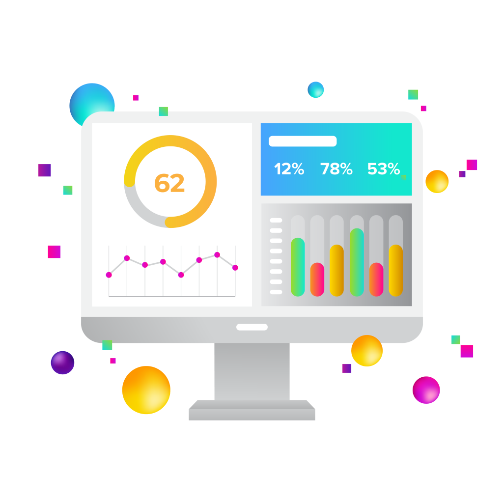
The most effective visualizations begin with a clear understanding of the question the audience is trying to answer. Data visualization is not simply about making charts look appealing. It is about communicating meaning.
For example, if a marketing team wants to understand growth over time, a line chart can reveal the trajectory of traffic, leads, or conversions across months or quarters. If the goal is to compare campaign performance across channels, a bar chart may make differences immediately visible. If the objective is to show how different segments contribute to overall results, proportional visualizations can help illustrate that relationship.
Experienced data visualization services begin by identifying the story the data needs to tell. The visualization is then designed to emphasize that story rather than overwhelm the audience with unnecessary detail.
Clarity always takes precedence over visual complexity. The best visualizations make insight feel obvious.
The Role of Color and Visual Hierarchy
Color is one of the most powerful elements in a visualization. It directs the viewer’s attention and helps distinguish meaningful patterns in the data. At the same time, color must be used carefully to avoid confusion.
Effective data visualization services use color to highlight what matters most. Important metrics may be emphasized through contrast. Performance improvements and declines can be distinguished visually. Categories can be separated without overwhelming the viewer.
Accessibility is also critical. Many users experience some degree of color vision limitation, which means visualizations must remain understandable regardless of how colors are perceived. This requires thoughtful contrast, clear labeling, and consistent design patterns.
A well-designed visualization uses color and layout to guide interpretation. The viewer immediately understands where to look and what the data is communicating.
Designing Dashboards That Encourage Exploration
Traditional reporting often attempts to present every possible metric at once. The result is clutter and confusion. Modern data visualization services solve this problem through interactive dashboards that allow users to explore information dynamically.
Rather than viewing a single static chart, decision makers can interact with the data. They may filter results by date range, examine performance across different audiences, or drill down into specific campaigns or programs.
For example, a marketing leader might begin by viewing overall campaign performance. With a few clicks, that same dashboard could reveal how performance differs by geographic region, audience segment, or advertising channel. The visualization adapts as the user explores.
This interactive approach allows dashboards to serve multiple audiences. Executives gain high-level insight, while analysts and marketing teams can explore the details behind those trends.
The Growing Influence of Artificial Intelligence in Visualization
Artificial intelligence is rapidly transforming how organizations analyze and visualize their data. Traditional dashboards required analysts to interpret patterns and translate numbers into insights. AI accelerates this process by analyzing large datasets instantly, identifying patterns, and surfacing meaningful signals that might otherwise go unnoticed. In environments where organizations collect data from many platforms, this capability helps convert overwhelming information into clear understanding.
Machine learning now plays a central role in modern data visualization platforms. These models study historical performance to learn what normal patterns look like. When new data deviates from those patterns, the system can automatically highlight anomalies. A sudden drop in website conversions, an unexpected increase in advertising costs, or a spike in user engagement can be flagged immediately. Instead of discovering issues days later, leaders can respond quickly with clear visual indicators that something has changed.
Artificial intelligence also enables predictive visualization. Traditional dashboards focus on past performance. AI-powered platforms increasingly show what is likely to happen next. By analyzing historical trends, customer behavior, and seasonal patterns, predictive models can generate forecasts that appear directly within dashboards. Sales leaders can see projected pipeline performance. Marketing teams can anticipate campaign outcomes. Operations teams can identify potential capacity challenges before they become problems.
Natural language interaction is making these insights more accessible across organizations. Instead of relying on complex reporting tools, users can ask questions in plain language and receive visual answers instantly. A marketing director might ask which campaign generated the highest return last quarter or which audience segment is converting most efficiently. The platform can then generate a visualization that answers the question clearly and immediately.
AI is also improving how organizations monitor performance over time. Intelligent systems can continuously analyze incoming data and produce automated summaries that highlight important changes and likely causes. Leaders no longer need to review every dashboard manually. Instead, they receive concise explanations of what changed and why it matters.
These capabilities transform dashboards from passive reporting tools into active decision support systems. Rather than simply displaying information, AI-powered visualization platforms highlight critical insights, identify emerging trends, and help leaders focus on the actions that matter most.
The Technology Behind Modern Data Visualization
Behind every effective visualization lies a carefully designed technology environment that connects data sources, analysis platforms, and presentation tools.
At New Target, data visualization services often involve integrating multiple systems to create a unified view of performance. Marketing data may come from Google Analytics, Google Search Console, advertising platforms, and social media channels. Customer engagement data may originate from platforms such as HubSpot or Salesforce. Associations may rely on membership systems or event management platforms that generate their own datasets.
Our team frequently uses modern visualization and analytics platforms such as Tableau, Microsoft Power BI, and Looker Studio to transform these data sources into interactive dashboards. These tools allow organizations to visualize complex information clearly while maintaining real-time connections to underlying systems.
For organizations that manage large datasets or complex digital ecosystems, visualization may also involve structured data pipelines and data warehouses using platforms such as BigQuery or Snowflake. These systems consolidate data from multiple sources and ensure dashboards remain accurate and scalable.
AI-driven analytics tools are also becoming an important part of this ecosystem. Platforms such as HubSpot AI analytics, Google Cloud machine learning tools, and advanced predictive modeling environments allow organizations to detect patterns that traditional reporting might miss.
The result is an integrated analytics environment where data flows automatically and visual insights update continuously.
Visualization as a Communication Tool
Data visualization is not only valuable for internal analysis. It also plays a critical role in communication.
Organizations frequently need to explain performance and impact to stakeholders who may not have technical backgrounds. Board members, donors, partners, and public audiences all benefit from clear visual storytelling.
Effective data visualization services help organizations present complex information in ways that are both compelling and understandable. Annual reports can illustrate growth and impact through visual narratives. Marketing performance reviews can show campaign results clearly. Public dashboards can help organizations communicate transparency and accountability.
When data is visualized well, it becomes persuasive. Stakeholders can see the evidence behind strategic decisions rather than relying solely on written explanation.
Connecting Visualization to Real Business Outcomes
The ultimate purpose of visualization is not simply to display information. It is to support action. A chart that looks impressive but does not influence decisions has limited value. Effective visualization helps leaders understand what is happening in their organization and what they should do next.
When dashboards clearly reveal performance trends, organizations can respond more quickly and allocate resources more effectively. Instead of waiting for monthly reports or digging through spreadsheets, decision makers can immediately see which initiatives are producing measurable results. This clarity shortens the feedback loop between strategy and execution. When leadership teams see performance signals earlier, they can refine campaigns, shift resources, and correct course before small issues become large problems.
Marketing teams
Marketing teams benefit enormously from this type of visibility. A well-designed dashboard can reveal which campaigns generate the highest quality leads, which channels drive the most conversions, and which audience segments respond most strongly to specific messages. Instead of spreading the budget evenly across channels, marketing leaders can concentrate spending where it produces the greatest impact. Over time, this creates a compounding effect where every campaign becomes smarter than the last because insights from previous campaigns are immediately visible and actionable.
Associations
Associations also gain significant value from visualization when it comes to member engagement. Membership organizations manage complex ecosystems of events, publications, certifications, and community programs. Data visualization services help association leaders understand which initiatives truly deliver value to members. For example, dashboards may reveal that members who attend certain webinars are more likely to renew their membership, or that participation in local chapters correlates with higher long-term engagement. When these patterns become visible, associations can design programming that strengthens member relationships and improves retention.
Nonprofits
Nonprofits face similar challenges when evaluating fundraising strategies. Donation programs often involve multiple campaigns across email, social media, events, and peer-to-peer fundraising platforms. Visualization helps nonprofit leaders quickly understand which approaches resonate most strongly with donors. A clear dashboard might show that a specific storytelling approach dramatically increases donation rates, or that certain donor segments respond best to recurring giving programs. With this insight, nonprofits can refine their outreach strategies and focus on the messages and channels that inspire generosity.
Alignment
Another important benefit of visualization is alignment across teams. In many organizations, marketing, communications, development, and leadership teams rely on different reports and metrics. Data visualization services create a shared view of performance that everyone can understand. When teams work from the same dashboards and the same definitions of success, collaboration improves, and decision-making becomes more consistent. Instead of debating whose numbers are correct, teams can focus on interpreting what the numbers mean and how to act on them.
Accountability
Visualization also strengthens accountability. When performance metrics are presented clearly and updated regularly, organizations can track progress toward strategic goals with greater confidence. Leaders can see whether initiatives are delivering the expected results, and teams can measure the impact of their work in real time. This level of transparency encourages disciplined execution because progress is visible to everyone involved.
Over time, visualization transforms how organizations learn from their own data. Instead of relying on intuition or isolated reports, leaders develop a habit of asking questions and seeking answers through data. Patterns become easier to identify, experiments become easier to evaluate, and strategic decisions become more evidence-based.
Visualization turns measurement into guidance. It shows where progress is happening and where improvement is needed. The goal is not simply to report the past but to illuminate the path forward.
In this way, data visualization services become a powerful tool for organizational learning and continuous improvement. When implemented thoughtfully, they help organizations move from reactive reporting to proactive decision-making. Leaders gain confidence in their strategies because the evidence supporting those strategies is visible, understandable, and connected directly to the outcomes that matter most.
How New Target Helps Organizations Transform Data into Insight
At New Target, we help organizations turn complex data environments into clear, actionable insight. Our data visualization services combine strategy, design, and advanced analytics technology to create dashboards and reporting systems that make performance understandable at every level of the organization.
Our team works with associations, nonprofits, government organizations, and brands to connect their data sources and design visual experiences that reveal what matters most. Using tools such as Tableau, Power BI, Looker Studio, and integrated analytics platforms connected to systems like HubSpot and Salesforce, we build dashboards that are accurate, interactive, and aligned with real business goals. We also incorporate emerging AI capabilities that help surface hidden patterns and predictive insights that guide smarter decision-making.
When organizations can clearly see their data, they gain the confidence to act. New Target helps clients transform scattered information into visual intelligence that drives growth, accountability, and strategic clarity. If your organization is ready to turn complex data into decisions that move the business forward, our team is ready to help. Let’s chat.
A global team of digerati with offices in Washington, D.C. and Southern California, we provide digital marketing, web design, and creative for brands you know and nonprofits you love.
Follow us to receive the latest digital insights:

- 9 min read
For years, digital advertising has largely meant meeting people in one of two places: where they search or where they spend time. Google Ads captures people actively looking for something....

- 6 min read
Choosing a website platform often begins with a spreadsheet. The organization gathers requirements. Someone creates columns for security, accessibility, integrations, content management, scalability, performance and cost. WordPress, Drupal, Webflow, and...

- 7 min read
Public relations used to be relatively straightforward. Your organization developed its message, communicated with journalists and industry publications, issued press releases, cultivated relationships and tried to earn positive coverage. All of...

- 7 min read
For years, association website redesigns tended to begin with a familiar complaint: Our website looks dated. That is still a legitimate concern. Design matters. But in 2026, appearance is a...