
Data visualization techniques are the graphical representation of information and data. By using visual elements like charts, graphs, and maps, data visualization tools provide an accessible way to see and understand trends, outliers, and patterns in data. In the context of user experience (UX), data visualization can significantly enhance the way users interact with and comprehend complex datasets, making it a crucial aspect in various industries and applications.
Popular Data Visualization Techniques
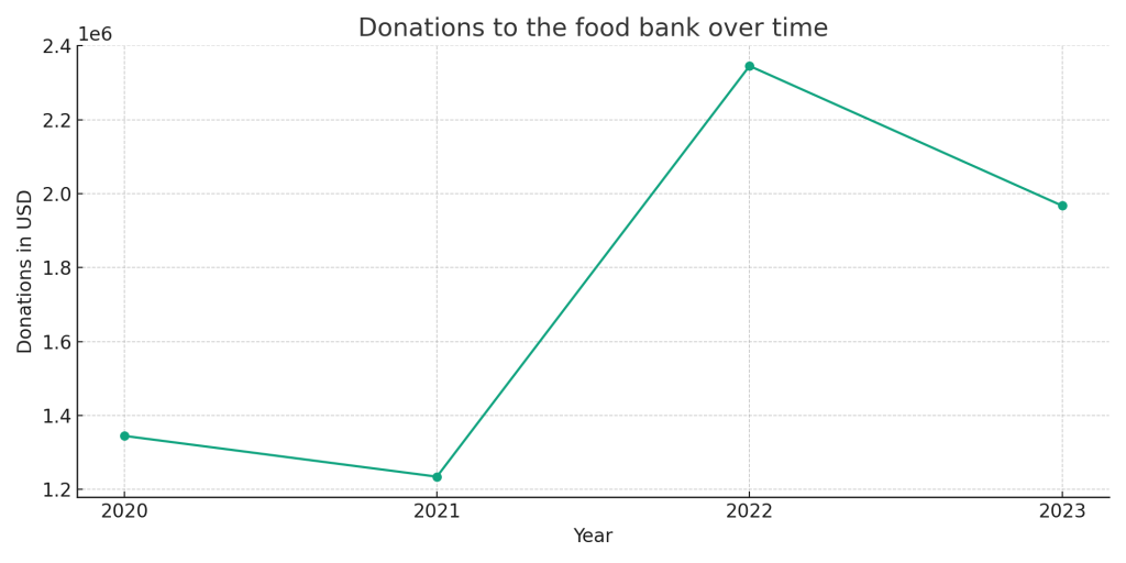
Line Chart
Description: A line chart or line graph displays information as a series of data points, called ‘markers,’ connected by straight line segments. It is a basic type of chart common in many fields. A line chart is often used to visualize a trend in data over intervals of time – a time series – thus the line is often drawn chronologically.
It is particularly useful for showing trends over time and analyzing the relationships between two variables.
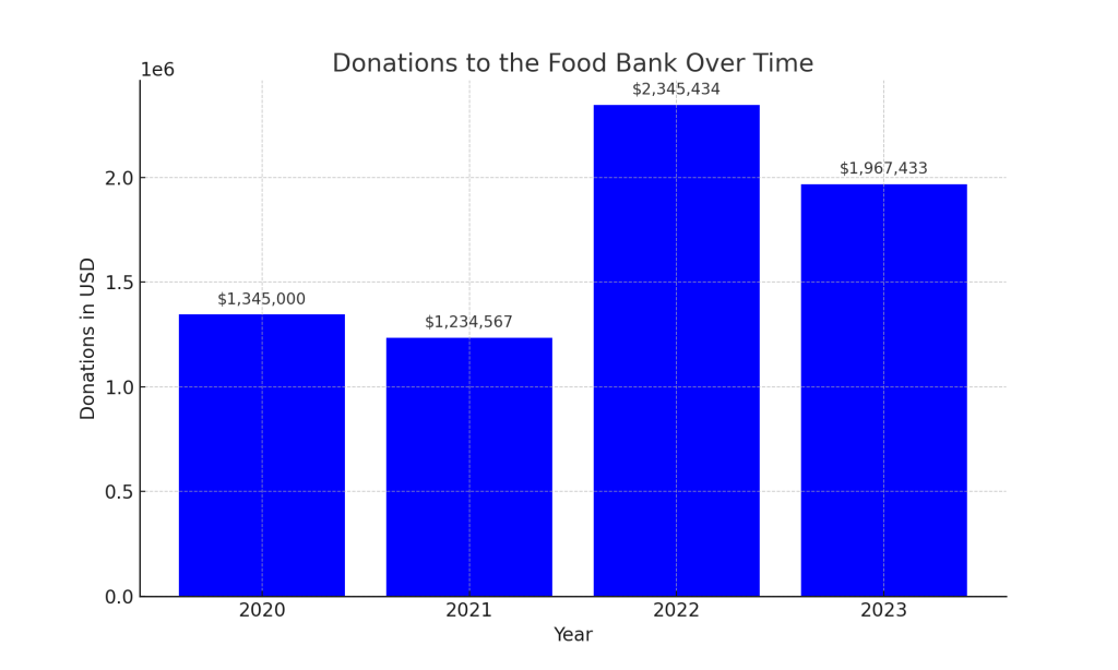
Bar Chart
Description: A bar chart presents categorical data with rectangular bars with heights or lengths proportional to the values that they represent. The bars can be plotted vertically or horizontally. A vertical bar chart is sometimes called a column chart.
Bar charts are ideal for comparing several sets of data between different groups.
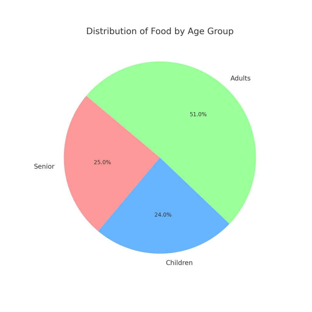
Pie Chart
Description: A pie chart is a circular statistical graphic, which is divided into slices to illustrate numerical proportion. In a pie chart, the arc length of each slice (and consequently its central angle and area), is proportional to the quantity it represents.
Pie charts are best used when trying to work out the composition of something. If you have categorical data then using a pie chart would work really well as each slice can represent a different category.
Other Popular Data Visualization Techniques
Scatter Plots
Display values for typically two variables for a set of data. The position of each dot on the horizontal and vertical axis indicates values for an individual data point. Scatter plots are used to observe relationships between variables.
Area Charts
Similar to line charts, but the area between the axis and line is filled with colors or textures. They are useful for representing cumulative totals using numbers or percentages over time.
Heat Maps
Use colors to represent data values in a matrix. They are useful for visualizing the magnitude of a phenomenon as color in two dimensions.
Treemaps
Display hierarchical data using nested rectangles. Each branch of the tree is given a rectangle, which is then tiled with smaller rectangles representing sub-branches.
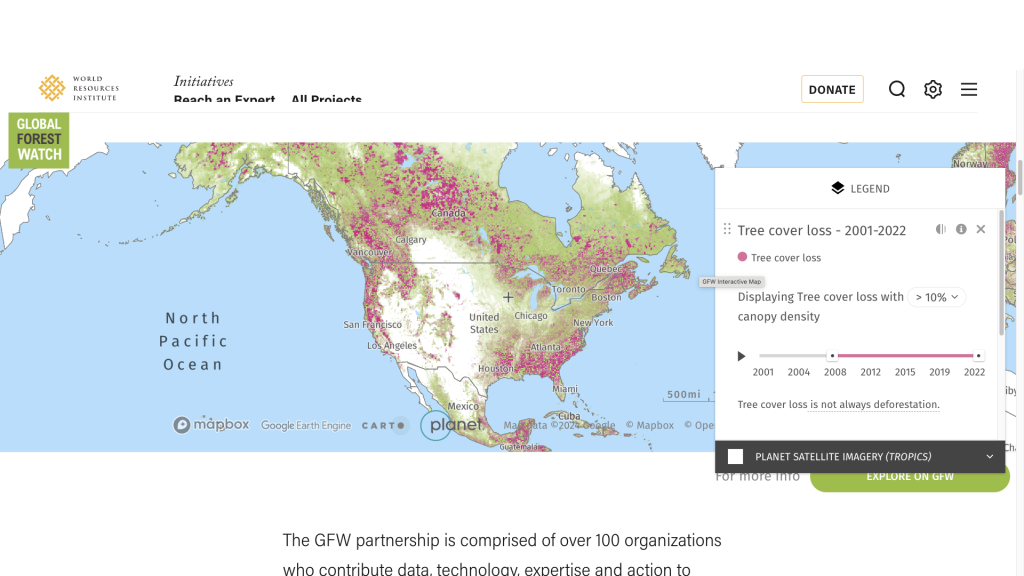
Choropleth Maps
Geographic maps where areas are shaded or patterned in proportion to the measurement of the statistical variable being displayed, such as tree cover loss in North American between 2008 and 2022. This map is from work New Target did for the World Resources Institute: Global Forest Watch.
Infographics
Combine charts, graphs, text, and images to present data and information in a visually compelling way, making complex information easier to understand.
Each of these techniques has its own best use cases and can be chosen based on the type of data being visualized, the audience, and the story that needs to be told.
How Data Visualization Techniques Improve UX
Data visualization techniques are transformative tools in enhancing user experience (UX) by translating complex data into visual formats that can be quickly interpreted. This method taps into the human brain’s ability to process visual information at a much higher speed than text, allowing for more immediate comprehension and recognition of data patterns and insights. Not only does this facilitate faster processing, but also it promotes greater user engagement through visually appealing and interactive elements that draw users in and encourage exploration. A well-crafted visualization can significantly increase memory retention over textual descriptions, as the use of color, shape, and space helps anchor data points in the user’s mind.
The simplification of intricate data into clear visual representations is particularly valuable, as it enables users of varying levels of expertise to understand and interact with the data without feeling overwhelmed. This democratization of data fosters an inclusive environment where more people can participate in data-driven decision-making. Moreover, interactive data visualizations allow for personalized exploration, enabling users to drill down into specific details and view information from multiple angles, which can enhance problem-solving capabilities and lead to better-informed decisions.
On the aesthetic front, a visually engaging interface enhances user satisfaction, contributing to a positive interaction with the product or service. Additionally, well-designed data visualizations can aid in the quick identification of data discrepancies and anomalies, thus improving the reliability of data interpretation.
However, the key to leveraging the full potential of data visualization lies in its thoughtful integration into the UX design. It’s crucial that visualizations are not only accurate but also relevant and aligned with the users’ needs and goals. Overcomplex or irrelevant visualizations can confuse users and detract from the user experience.
The focus should always be on creating visualizations that are user-centered, clear, and intuitive, thereby instilling confidence in the users about their data literacy and the insights derived from the data. This strategic approach to incorporating data visualizations within the UX design framework can transform how users interact with and benefit from data, ultimately leading to a more engaging, informative, and effective user experience.