Pixel Perfect: Web Design for 4K+
- 4 min read
Highlights
- The average adult can differentiate 4K from lower resolutions, with some sources stating 5K as optimal.
- 4K resolution, or Ultra HD, equals four times the pixel amount of a standard HD monitor.
- Designing for 4K involves using scalable vector graphics (SVGs) rather than raster graphics to ensure image quality.
- HTML and CSS can create vector graphics, while CSS Media Queries adapt the display to users' devices.
- Web designers also need to consider font appearance and 4K video to optimize the user experience.
It’s not hard to understand why the resolution revolution keeps our interest: This is a time when more really is better. Technology has given us the gift of stunning imagery on everything from our large screen TVs to our laptops to our cell phones. Sure, we are probably all at the point where we expect it and even take it for granted. Regardless, as the meaning of high definition changes, it just keeps getting better. As the resolution revolution is picking up steam, you can enjoy it as a consumer, but as a web professional, how do you design for it?
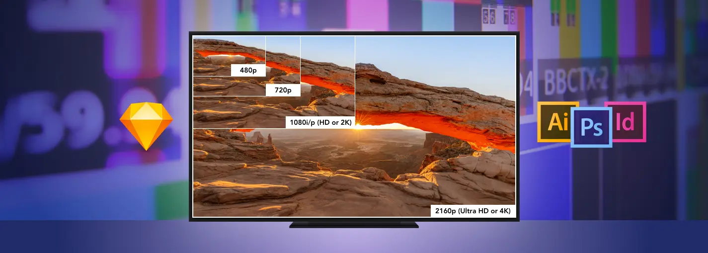
Let’s first address the elephant in the room: Can the average, healthy adult differentiate 4K from lower resolutions or is all of this for marketing’s sake? According to several sources who understand the science, the answer across the board is “Yes,” with some stating that 5K, as seen in the Apple’s Retina MacBook, is optimal. That’s the good news. Now, what does 4K mean, technically? The standard computer monitor (2K) has an HD resolution of 1920×1080 which equals 2 million pixels. 4K resolution, or Ultra HD, is equal to four times the number of pixels with a resolution of 3840×2160. Given the increased resolution, there are likely to be some issues that arise when designing for users with 4K monitors. As a designer, your first order of business is to purchase, or borrow, a 4K monitor so that you can see how your work will look and you won’t have to guess. Next, you’ll need some guidance on how to deal with content, graphics, and video.
GRAPHICS
A website that is designed for 4K will look small, constricted, and have too much whitespace when viewed on a typical 2K monitor. This can be remedied by designing for a larger screen or by upscaling your content and graphics so that they fit the space appropriately. The best piece of advice in designing for 4K is to use scalable vector graphics (SVGs) instead of raster graphics like JPGs, GIFs, or PNGs unless absolutely necessary. Raster graphics are created as a fixed set of pixels so when they are scaled up, they become pixelated. Vector graphics, on the other hand, are stored as XML text files that define shapes and paths. And, since they aren’t comprised of pixels, their integrity isn’t compromised when they are enlarged.
USER INTERFACE ELEMENTS AND NON-VECTOR IMAGES
Fortunately, you can use HTML + CSS to create vector graphics that would normally be created in Photoshop or Illustrator which will reduce the graphics load time on your site. For user interface elements such as icons, buttons, and widgets, you can use CSS to scale and style these elements so that they appear clear regardless of the viewer’s screen resolution.
When designing for a site, you won’t always have the option of using solely vector-based images. Most websites utilize photography, so here are a few options that you can use to resize images for various screen resolutions:
-Set up your CSS Media Queries with mobile in mind so that the display will adapt to the users’ devices, and it will choose which non-vector images (including photographs) to load based on their resolution. This results in increased download speeds, less server space usage, and most importantly, a better user experience.
-Use two versions of the same image—one higher resolution and one lower resolution and then utilize a JavaScript function to dynamically serve the correct resolution for users depending on their screen resolution. The downside of this option is that it adds load time to the page.
-Use HTML to define the image size with an alternative supplied for HD displays.
Designing for responsive 4K and retina screens using non-vector based images such as logos, illustrations, and icons means that you will be tasked with calculating and resizing images. This can be accomplished by utilizing a unit of measurement called density independent pixels (DP). A DP corresponds to the physical size of a pixel at 160 dpi: For example, 60×60 is 1x, 120×120 is 2x (double the pixel dimensions), and 180×180 is 3x (triple the pixel dimensions). This unit of measurement enables the device it is viewed on to multiply by its own pixel density ratio for optimal quality.
After you have created or resized images for 4K and retina, you will most likely be left with several image files. Starting with a clear naming convention like the samples below or saving them in different directories will help with effective file management.
/img/
/img/retina
/img/header.jpg
/img/header-2x.jpg
FONTS
Let’s not forget about the smallest component of your website—fonts. Fortunately, the market is prepared for 4K and beyond. Designing with fonts that appear appropriate for 4K can be as simple as using the CSS @font-face rule. @font-face frees you from being tied down to the particular set of fonts that the user has by enabling you to download fonts from your server. It also comes in handy by scaling those fonts based on the screen resolution, so it eliminates the possibility of fonts appearing pixelated and inappropriately sized.
VIDEO
After checking off graphics, user elements, and fonts, there is one consideration left and that is video. Video is wildly popular which is probably due to the fact that web visitors don’t have a lot of time and they want their content in an easy-to-consume format. With those demands, utilizing 4K video is essential for giving users an optimal viewing experience. If you plan to shoot with 4K video, don’t fret. Many cameras and smartphones are already set up to handle a higher resolution. If you are simply looking for 4K video, many popular stock sites have a variety of higher resolution videos to choose from.
Designing for 4K may be a new task for you, but there are many solutions already in place that address the issues that come with higher resolution monitors. Once you get a few sites under your belt, you will see that the results can be stunning and you will enjoy 4K as both a consumer and a web professional.
A global team of digerati with offices in Washington, D.C. and Southern California, we provide digital marketing, web design, and creative for brands you know and nonprofits you love.
Follow us to receive the latest digital insights:

- 5 min read
AI Shopping Is Here! Online shopping is changing. For many years, ecommerce success depended on achieving a high ranking from the search engines and convincing shoppers to click on a...

- 6 min read
Article Summary: Private AI is an artificial intelligence solution that runs within your organization’s controlled environment, enabling AI-powered search, automation, and assistance while protecting sensitive data, intellectual property, and regulatory...

- 5 min read
Website Maintenance Has Entered the AI Era Website maintenance has always been important and fairly predictable. The goal of website maintenance was to keep the software updated, monitor its security...

- 6 min read
Once you have invested significant time and money and finally managed to bring visitors to your website to generate leads, what then? The moment a visitor fills out a website...