Nonprofit Website Accessibility: 7 Practical Steps to Improve Your Reach
- 20 min read
Highlights
- Website accessibility is crucial for nonprofits, as roughly a quarter of U.S. adults have a disability. An inaccessible site excludes potential visitors, donors, and volunteers.
- Most websites, including those of nonprofits, aren't compliant with current accessibility standards, creating digital barriers for users with visual, auditory, motor, or cognitive impairments.
- Website accessibility isn't merely technical or legal; it confirms a nonprofit's commitment to inclusivity. Similarly, an accessible website avoids legal and reputational risks related to the Americans with Disabilities Act.
- Web Content Accessibility Guidelines (WCAG) and ADA compliance are key to ensure website accessibility. They help nonprofits reach and serve diverse communities, boost SEO, and increase user engagement.
- Improving website accessibility involves optimizing visual design, ensuring sufficient color contrast, adding descriptive alt text to images, making the site screen reader-friendly, enabling full keyboard navigation, designing user-friendly forms, and providing captions and transcripts for multimedia content.
Why Website Accessibility Is Mission-Critical
For nonprofits dedicated to helping others, an inaccessible website is like a locked door on your community center. You might be unwittingly shutting out a significant portion of the people you aim to serve. Consider that approximately one in four U.S. adults has some form of disability. If your nonprofit’s site isn’t accessible, you could be turning away over 25% of potential visitors including prospective donors, volunteers, and clients who may have otherwise engaged with your mission. That’s a loss no organization can afford.
Yet the reality is that most websites today have serious accessibility issues. A recent analysis of one million home pages found 56,791,260 accessibility errors which averages 56.8 errors per page. In fact, a staggering 98% of websites fail to comply with modern accessibility standards. The nonprofit sector is no exception; even well-meaning organizations often overlook digital barriers that frustrate users with visual, auditory, motor, or cognitive impairments.
Why does this matter so much? Because digital accessibility isn’t just a technical checklist or a legal formality, it’s a direct extension of your nonprofit’s mission. If your goal is to serve the community, that community includes people of all abilities. An accessible website ensures everyone can learn about your programs, sign up for services, donate, or volunteer, regardless of whether they navigate with a screen reader, a keyboard, or other assistive technology. In short, accessibility online is just as important as having wheelchair ramps at a physical office; it’s about equal access and inclusivity in the digital age.
There’s also a practical consideration: nonprofits face growing legal and reputational risks if their sites are inaccessible. In the United States, websites are increasingly considered “public accommodations” under the Americans with Disabilities Act (ADA), which means organizations can be held accountable for digital barriers just as they would for physical ones. We’ve seen a rising tide of lawsuits and demand letters targeting sites that don’t accommodate users with disabilities. Beyond legal risk, an inaccessible site can hurt your reputation and trust within the community.
On the flip side, proactively embracing accessibility can enhance your reputation as a forward-thinking, inclusive organization, not to mention it opens your message to a wider audience, which can translate to more support and engagement.
In this article, we’ll explore how your nonprofit can improve its website’s accessibility to better reach and serve diverse communities. We’ll start by demystifying the key standards (like WCAG 2.1 and ADA compliance) and why they matter. Then we’ll dive into practical steps from visual design tweaks and color contrast fixes to adding alt text and making your site work with screen readers and keyboards.
Along the way, you’ll see real-world case studies of nonprofits that revamped their sites to be more accessible, and learn how these improvements not only further social good but also boost SEO and user engagement. Lastly, we’ll share tips on how to continually evaluate and maintain accessibility, including handy tools and resources. By the end, you’ll be equipped and, we hope, inspired to make your nonprofit’s online presence welcoming to all.
Navigating the Standards: WCAG 2.1 vs. ADA Compliance
When it comes to web accessibility, two acronyms you’ll encounter often are WCAG and ADA. Understanding these is a crucial first step in your accessibility journey.
WCAG
WCAG (Web Content Accessibility Guidelines) 2.1 is essentially the playbook for making web content accessible. Developed by the World Wide Web Consortium (W3C), WCAG 2.1 lays out a comprehensive set of technical guidelines used worldwide as the gold standard for accessibility. Think of WCAG as the how-to manual: it defines what it means for content to be perceivable, operable, understandable, and robust for users with disabilities. WCAG 2.1 builds upon earlier versions (2.0) by adding criteria that address mobile accessibility, low vision, and cognitive impairments, among others.
The guidelines are organized into three levels of conformance: Level A (minimum basic accessibility), Level AA (mid-range, and the target level for most sites), and Level AAA (highest, strictest level). For context, most organizations aim to meet at least WCAG 2.1 Level AA as a baseline, since that level covers the essential barriers; in fact, websites that have been mandated by courts to comply with accessibility are typically held to AA level standards. Meeting WCAG 2.1 AA means things like ensuring sufficient color contrast, providing alt text for images, enabling keyboard navigation, and much more (we’ll cover many of these soon). It’s important to note that WCAG itself isn’t a law, it’s a set of guidelines, but it has become the de facto benchmark for legal compliance in many cases.
ADA
On the other hand, ADA is a U.S. civil rights law. Enacted in 1990 (before the web as we know it existed), the ADA prohibits discrimination on the basis of disability in places of public accommodation. Over time, this has been interpreted to include websites and digital services. In plain terms, the ADA requires that people with disabilities have equal access to your programs and information, including on the web.
The Department of Justice has explicitly stated that ADA requirements apply to the online services of organizations, not just their physical facilities. This includes nonprofit organizations. If you’re offering services, information, or fundraising opportunities via your website, you need to ensure those are accessible to people with disabilities. Unlike WCAG, the ADA doesn’t spell out technical standards in its text.
This can be confusing. How do you know if your site is “ADA compliant”? That’s where WCAG comes in. In practice, following WCAG 2.1 guidelines is the surest way to achieve ADA compliance for your website. Judges, attorneys, and accessibility experts overwhelmingly reference WCAG criteria when evaluating if a site is accessible under ADA. In other words, WCAG is the measuring stick by which ADA compliance is often judged in the digital realm.
To boil down the difference: WCAG 2.1 is a set of guidelines (the standards), and ADA is the law (the obligation). WCAG tells you what to do; ADA says why you must do it (to avoid discrimination). For a nonprofit, this means that even if you’re not explicitly governed by strict regulations (some smaller nonprofits wonder if ADA Title III really applies to them), you are strongly encouraged, if not morally obligated, to make your site accessible. Not only does it align with your inclusive values, it also reduces legal risk and liability.
Many nonprofits choose to adopt WCAG 2.1 AA as a policy, even absent a specific legal mandate, because it’s the right thing to do and it future-proofs against potential complaints. It’s worth noting that certain nonprofits may have additional requirements too: for example, if your nonprofit receives federal funding or is a government grantee/partner, you might also need to comply with Section 508 of the Rehabilitation Act.
Section 508 is another law that requires federal agencies (and organizations doing business with them) to have accessible ICT (information and communication technology). The good news is Section 508 was updated to essentially reference WCAG guidelines as well, so by meeting WCAG 2.1 AA, you’re covering those bases too.
One more benefit of embracing these standards: it can open new doors. Funders and partners increasingly expect accessibility. For instance, ensuring your site meets WCAG 2.1 AA can increase your eligibility for certain grants or partnerships (especially with government or large institutional funders), on top of protecting you from legal pitfalls. In short, standards and compliance are not just red tape, they’re tools to help your nonprofit be inclusive, credible, and ready to collaborate on a bigger scale.
Now that we’ve set the stage with the “what and why” of accessibility standards, let’s get into the fun part: the “how.” How can you actually improve your website accessibility in practical terms? The good news is that accessible design is just good design. Many best practices that help users with disabilities will make the experience better for all users. Let’s walk through some key focus areas and steps you can take.
7 Practical Steps to Improve Your Nonprofit’s Website Accessibility
Improving website accessibility can feel like a big task, but it becomes manageable when you break it down into specific areas. Below, we cover the core aspects from visual design and color choices to the nuts and bolts of navigation and forms that collectively make a website welcoming to everyone. You don’t necessarily need to be a developer to understand these (though you might involve one for certain fixes). Many changes are common-sense adjustments or additions you can implement with your content management system or with minor tweaks. Let’s dive in:
1. Optimize Visual Design and Layout for Clarity
Start with a clean, straightforward design. A cluttered or confusing layout can pose challenges for people with cognitive disabilities, low vision, or those using screen magnification. Keep your navigation menus consistent and logically organized on every page, so visitors don’t have to re-learn how to get around. Use plenty of white space and clear headings to break up content into digestible sections; this benefits everyone, from a senior with mild vision loss to a hurried user on a mobile phone.
Importantly, never rely on color or visual cues alone to convey important information. For instance, if required form fields are only indicated by a red border, or if a link is only identifiable by its color, some users will miss it. Users who have color vision deficiency (CVD) or those using screen readers won’t pick up those cues. All critical indicators should have text labels or symbols. For example, you might add an asterisk and the word “required” to a form field label instead of just a red outline. This principle is emphasized in accessibility guidelines: no content or instructions should depend solely on sensory characteristics like color, shape, or position. In practice, that means links should be underlined or otherwise differentiated beyond just color, and form errors should include text, not just a red highlight.
Consistent, intuitive visual design helps people with cognitive and learning disabilities as well. Many nonprofits use compelling visuals like photos and infographics to tell their story. That’s great, but ensure these visuals don’t overwhelm or confuse the layout. Use images in moderation and with purpose, and always anchor them with explanatory text or captions if needed. If you have automatic slideshows or carousels, make sure they don’t flicker or move too fast (flashing content can trigger seizures or simply annoy users). Ideally, provide controls to pause or manually advance slides.
As a rule, avoid any flashing, strobing, or rapidly animating elements that could be harmful to users with epilepsy or vestibular disorders. If you use video backgrounds or animations, give users the ability to turn them off. Remember, an accessible design is a user-friendly design and by simplifying and clarifying your layout, you’re benefiting every visitor, not just those with special needs.
2. Ensure Sufficient Color Contrast for Text
Have you ever tried to read grey text on a light background and found yourself squinting? Low contrast text isn’t just a minor annoyance, for many people it’s a deal-breaker. Color contrast refers to the difference in brightness between text (or important interface elements) and its background. Good contrast makes content readable for people with low vision or color vision deficiencies, as well as for anyone trying to read your site on a sunny day with glare on their screen. In fact, low-contrast text is the single most common accessibility issue on homepages according to recent audits. One study found that a whopping 81% of home pages had text contrast below recommended levels, meaning a huge chunk of the web is literally hard to read.
To avoid falling into that category, adhere to the WCAG guidelines for contrast. For normal body text, aim for a contrast ratio of at least 4.5:1 between the text and its background. This ratio can be measured using free tools (just Google “contrast checker” and you’ll find several – WebAIM’s contrast checker is a popular one). For larger text (generally 18px and above, or 14px bold), a slightly lower contrast (3:1) is acceptable, but it never hurts to err on the higher side. If you want to go above and beyond, strive for 7:1 contrast ratio which meets the highest AAA level for critical content.
What do these ratios mean in practice? As an example, black or dark navy text on a white background has excellent contrast (~21:1). Black on yellow is also very high contrast. On the flip side, light gray text on a white background might only be 1.5:1, virtually illegible to many. There are browser extensions and plugins that can simulate how your color scheme appears to someone with color blindness or low vision; these are great for testing. If your nonprofit’s brand colors are very light or pastel, you might need to adjust the design – perhaps using those colors more for decorative elements while keeping text in a darker hue.
Making text more readable with good contrast and sufficient font size (don’t make users pinch-zoom just to read paragraphs) will help not only users with visual impairments, but also older adults and frankly anyone reading on a small screen. Clarity is universal. And here’s a bonus: high contrast and clear text often means your content is more legible to search engine crawlers too, and it encourages visitors to actually read your content, which can improve engagement. So, check your site’s color contrast and adjust those stylesheets if needed – it’s one of the quickest, highest-impact accessibility wins you can get.
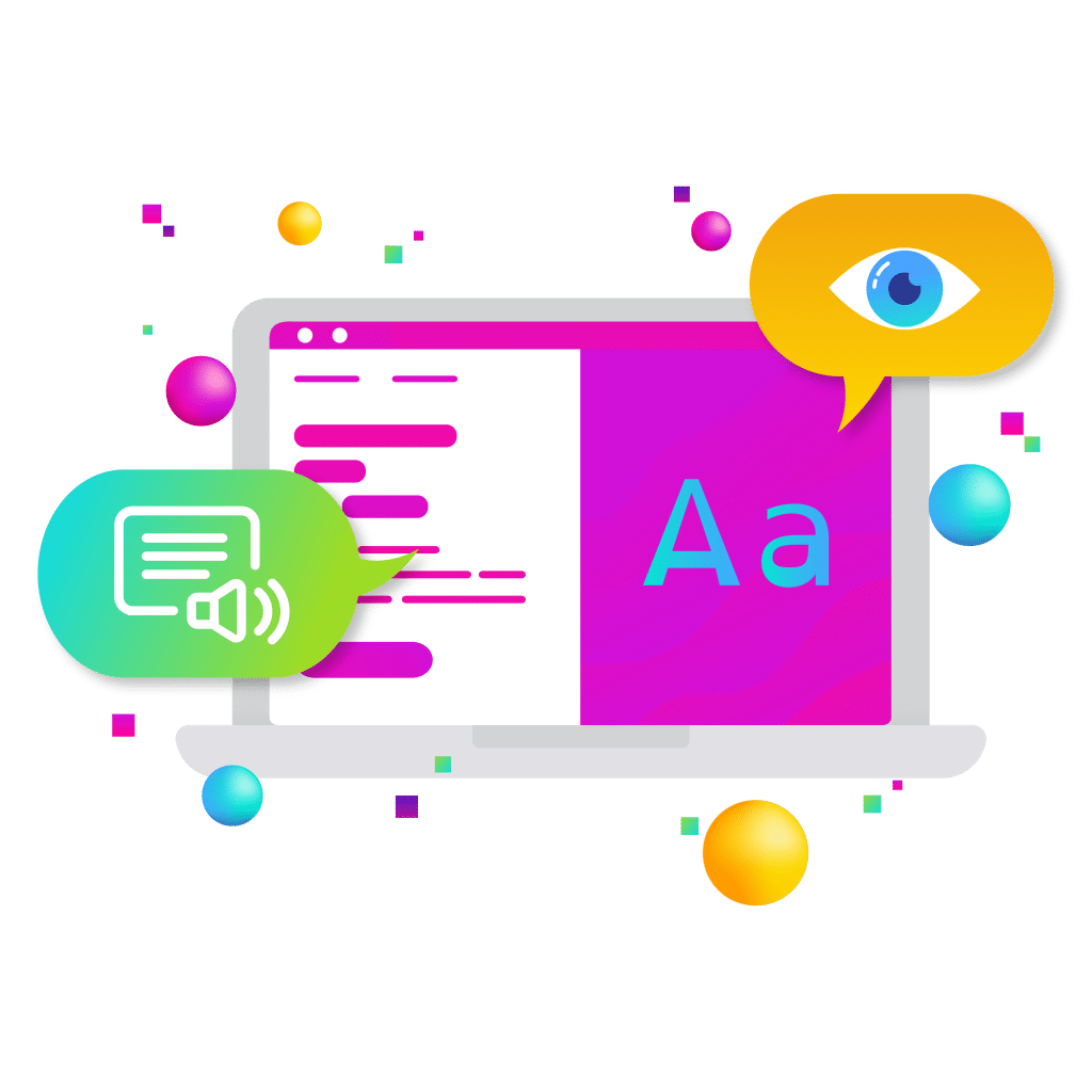
3. Add Descriptive Alt Text to Images
Nonprofit websites are usually rich in images like photos of your community work, impact graphics, campaign banners, you name it. But what happens if a visitor can’t see those images? This could be a blind user relying on a screen reader, or even someone with a slow internet connection where images don’t load. If you don’t provide alternative text (alt text) for your images, these visitors will miss out on vital content and context. Alt text is a written description of an image that is embedded in the HTML code; screen readers read it aloud to describe the image to users who can’t see it. It also displays in place of the image if it fails to load. Alt text ensures no one is left wondering, “I wonder what’s in that picture.”
Unfortunately, missing alt text is another very common accessibility gap. Over 60% of images on websites are missing alternative text according to accessibility scans. Imagine how many stories and messages are lost to users who can’t see those images. For nonprofits, this is especially poignant: those powerful photographs of people helped by your programs, or that infographic with crucial statistics – those need alt text so everyone can grasp their meaning.
So how do you write good alt text? First, be concise but descriptive of the image’s content and purpose. If the image is purely decorative or for layout (like a decorative border or a random stock photo that isn’t important), you can give it an empty alt attribute (alt=””) so that screen readers skip it. But if the image conveys information or emotion, describe what’s shown in a succinct way.
For example, if you have a photo of a volunteer helping a senior citizen plant vegetables in a community garden, a useful alt text might be: “Volunteer helping a senior citizen plant vegetables in a community garden.” This paints a clear picture. A bad alt text would be something like “IMG_12345.jpg” or “volunteer” – too vague. The rule of thumb is: convey the same function or information the image provides visually. If the image has text in it (like a graphic with a quote or a poster), that text should generally be included in the alt text or in the surrounding content.
By adding descriptive alt text, you not only enable blind or low-vision users to engage with your content, you also get a nice side benefit: better SEO. Search engine bots can’t “see” images, but they do index alt text. So describing your images can improve your search rankings (for example, your images might show up in Google Image search, and your pages become more findable for relevant keywords). It’s truly a win-win.
Make sure your website platform allows you to add alt text for every image (most CMSs like WordPress, Drupal, etc., have a field for “Alternative Text” when you upload an image). Use it every time. Encourage your content editors and social media team to get into this habit as well. Once you start doing it, writing alt text becomes second nature and it makes a world of difference for inclusivity.
4. Make Your Site Screen Reader Friendly (Semantic Structure)
Screen readers are software tools used by people who are blind or visually impaired to navigate websites. They literally read the content of the page out loud (or output it to a Braille display), including descriptions of images (via alt text), button labels, and other elements. To work well with screen readers, your website’s behind-the-scenes structure needs to be solid. The good news is that if you stick to standard HTML and good coding practices, you’re halfway there. Many accessibility issues arise when websites have sloppy HTML (like missing heading tags or unlabeled form fields), or when they use complex widgets without proper accessibility markup.
First, use proper semantic HTML for content structure. This means using heading tags (<h1> through <h6>) for titles and subtitles in logical order, using lists (<ul>, <ol>) for lists of items, <button> for buttons, <form> and <label> for forms, and so on. Screen readers rely on these tags to understand the page. For example, many screen reader users navigate by jumping from heading to heading to skim a page – this only works if your headings are coded as headings, not just paragraphs with bold styling. Each page should have a single main <h1> heading (usually the page title), and sub-sections should have <h2>s, <h3>s in order.
Avoid skipping heading levels or using headings purely for visual formatting. According to WebAIM, about 37.9% of pages are missing some level of heading structure (i.e., jumping from an <h1> to an <h3> with no <h2> in between, etc.), which can confuse users who depend on that structure. Think of it like an outline or table of contents for your content; it needs to be logical.
Next, ensure that interactive elements are properly labeled. Every link should have clear link text that indicates its destination or action (no generic “click here” links – imagine hearing “Click here… click here… click here” out of context; that’s frustrating and uninformative). Instead, use descriptive link text like “Read our Annual Report” or “Donate Now – Support Education Program”.
If you have icons or buttons that rely on visuals, add an aria-label or hidden text to them. For example, a button with just a search icon should have a label like aria-label=”Search”. Forms are a notorious pain point for screen reader users when not coded right: we’ll address forms in the next section, but in general, use actual <label> tags tied to each form input so the screen reader will read “Label Name: [field content]”.
It’s also helpful to include landmarks or regions in your page (HTML5 elements like <nav>, <main>, <footer>, <header>, <aside>). These allow screen reader users to jump to major sections of the page easily. For instance, a user can skip straight to the <main> content, bypassing repetitive menus (especially if you add a “Skip to Main Content” link at the top of your pages, which is visible on focus – this is a common accessibility feature). Many screen readers or browsers also list regions for quick navigation if those landmarks are present.
Another key point: keep your HTML code clean and logical. Avoid dumping huge blocks of raw text or using tons of nested divs for what could be simple content. Overly complex code can confuse assistive tech. As a best practice, stick to simple implementations for most things, for example, use an actual <button> element instead of a clickable <div> masquerading as a button via JavaScript. The W3C guidelines note that content should be built in a way that different browsers and devices (including assistive ones) can parse reliably, and using standard HTML elements is the best way to ensure that.
If you do use advanced widgets (like interactive maps, custom sliders, etc.), make sure you implement ARIA (Accessible Rich Internet Applications) roles and attributes appropriately. ARIA is a set of attributes that can fill in the accessibility information that isn’t provided by native HTML. But a word of caution: ARIA is powerful but should be used sparingly and correctly – adding ARIA won’t fix poorly structured HTML, and in some cases, misusing ARIA can make things worse. A common example of good ARIA use is adding role=”navigation” to your nav menus (if not using <nav> tag) or aria-expanded attributes on collapsible sections to inform screen readers of their state.
Lastly, test with a screen reader to truly know how your site fares. There are free screen readers like NVDA for Windows or VoiceOver built into MacOS. Try navigating your website with one: can you access all content? Does it read things in a sensible order? Are images described, and form fields announced with their labels? Doing this kind of hands-on test will reveal any glaring issues – maybe you’ll find that the order in which the screen reader reads content is weird (which might indicate you coded something out of sequence), or that certain links are announced with unclear names.
It can be eye-opening to experience your site the way a blind user would. By making your site screen reader friendly, you make it usable for a wide range of people, including those who are blind, have low vision, or even those who use screen readers for convenience (like voice-controlled systems). It’s a cornerstone of web accessibility.
5. Enable Full Keyboard Navigation
Not everyone uses a mouse or touchscreen to browse. Many people with motor disabilities, as well as blind users, rely on a keyboard (or keyboard-like device) to navigate websites. This typically means they use the Tab key to jump between focusable elements (links, buttons, form fields) and press Enter or Space to activate them. For these users, a site that cannot be navigated via keyboard alone is essentially unusable. Even beyond disability, think of power users or people with repetitive strain injuries who prefer keyboard shortcuts, or someone whose mouse just died – keyboard accessibility benefits them too.
A quick test for your site: unplug your mouse (or just pretend you don’t have one) and try to use your website with only the keyboard. Can you reach all the menus, links, and form controls by pressing Tab (and Shift+Tab to go backwards)? Is it clear which element on the page is currently “focused” as you Tab through (e.g., does a visible outline or highlight appear on the focused link/button)? Can you operate things like dropdown menus or modal dialogs via keyboard?
If you get stuck somewhere, say a pop-up opens and you can’t exit it with the keyboard, that’s a problem. Many sites have what we call “keyboard traps,” where focus gets lost or trapped in an area. Users should be able to navigate to and away from all interactable components smoothly. If a portion of your site (like a fancy image gallery or map) is not keyboard-friendly, a keyboard-only user effectively hits a dead end.
Remember, if someone can’t use a mouse, they should still be able to do everything on your site. This includes filling out donation forms, activating dropdowns, and clicking any “call to action” button. If they can’t, you are likely losing out on donations or sign-ups from those individuals. A telling statistic: one accessibility survey found nearly 90% of websites have at least one page with broken or inaccessible links/buttons for keyboard or screen-reader users. Let’s not have yours be one of them.
By making your site fully operable via keyboard, you not only cater to users with motor disabilities and blindness, but you also make it more robust for all sorts of alternative inputs (think voice control systems that simulate keyboard, etc.). It’s a hallmark of an accessibly-built site. Plus, as a bonus, Google’s algorithms appreciate sites that are well-structured and usable, and keyboard accessibility tends to go hand-in-hand with good coding practices that search engines favor.
6. Design Accessible and User-Friendly Forms
Forms are everywhere on nonprofit websites including newsletter sign-ups, contact forms, event registrations, and especially donation forms. These are often the last mile in achieving your website’s goals (getting that volunteer sign-up or donation completed), so you want everyone to be able to fill them out with ease. Unfortunately, forms can also be a minefield of accessibility issues if not coded and designed thoughtfully. Let’s break down how to make your forms accessible:
Always use labels for input fields. Every text box, dropdown, checkbox, etc., should have a corresponding text label that explicitly ties to that field. This is typically done in HTML by using the <label> tag with a for=”fieldID” attribute that matches the id of the form control. It sounds technical, but most form builders or CMS form plugins handle this if you use their “label” field. What you want to avoid is having a form field with no label, relying on placeholder text inside the field or on the visual position to imply what it is.
For example, a field that just shows grey text “Email” inside; that placeholder disappears when you start typing, and it might not be read out properly by a screen reader. Each form field should have a clear, visible text label adjacent to it (usually above or to the left). For instance: “Email Address: [input box]”. This ensures that when a screen reader user tabs to that field, it will announce “Email Address, edit text” (or similar), so they know what that field is for. It also helps everyone by providing a persistent cue, think of someone with short-term memory issues who might forget what a blank field was supposed to be after tabbing through; a visible label always there is much safer than a vanishing placeholder.
Provide instructions and feedback. If certain fields have special requirements (e.g., password rules, format of a date, etc.), include that information in the label or as helper text. Don’t assume everyone will just know. Also, be mindful of how you indicate an error. If a user submits a form with errors (say they missed a required field or typed an email incorrectly), the error messages should be presented in text, not solely by color or an icon. It’s common to highlight a field in red which is fine, but also include a text message like “Email is required” or “Please enter a valid email address” near the field (and ensure that gets focus or is announced). Ideally, when the form reloads with errors, focus should move to the top error message so screen reader users hear it immediately.
According to accessibility guidelines, if a user makes an input error, the site should describe the error in text and, if possible, offer suggestions to fix it. For example: “The credit card number you entered is too short, please check and re-enter. It should be 16 digits.” This benefits users with cognitive limitations as well – clear, specific feedback helps everyone correct mistakes.
Make forms keyboard-friendly. We touched on keyboard nav already, but it’s worth reiterating in context of forms: users should be able to tab through fields in a logical order (usually top to bottom of the form) and hit Enter or Space to activate any buttons (like “Submit”). Avoid using fancy custom controls that aren’t standard form elements, or if you do, ensure they can be operated by keyboard and are labeled. For example, some donation forms use custom sliders or drop-downs for donation amounts, so make sure those are accessible (or provide an equivalent basic input). Always test by trying to fill out the form using only a keyboard and screen reader. Can you tell what each field is? Does the focus move predictably? Can you submit?
Keep the design of form fields simple and clear. High contrast applies here too: text in input fields should meet contrast requirements against the background of the field. Use a decent font size (at least 16px) for inputs to aid readability. And make the clickable areas big enough, checkboxes or radio buttons that are super tiny can be hard for anyone to hit, especially someone with tremors. If your form has multiple pages or steps, indicate progress in a clear way (e.g., “Step 2 of 3: Contact Information”) and allow users to review before final submission if possible.
CAPTCHAs deserve a mention, since many forms use them to prevent spam. Traditional CAPTCHAs (like “type the letters in this distorted image”) are terribly inaccessible, so avoid them if you can. If you must, use more accessible alternatives: CAPTCHAs that are based on simple questions, or the newer “I am not a robot” checkbox type, or at least provide an audio option. The best scenario is using backend spam filters so you don’t challenge the user at all. Nothing is more frustrating than a blind user being unable to submit a form because they can’t solve a CAPTCHA.
By implementing these form accessibility practices, you make sure that everyone can complete transactions and interactions on your site. There’s a famous guideline in UX that says “don’t make me think.” For an accessible form, we might say “don’t make me guess.” Labels, instructions, and feedback should be crystal clear. As a result, you’ll likely see higher completion rates overall. After all, many sighted users have abandoned forms out of confusion too! By catering to those with disabilities, you end up with forms that are user-friendly for all. And remember, if your donation form isn’t accessible, you are quite literally leaving money on the table by excluding potential donors who would give if only they could complete the process easily. It’s worth the effort to fix.
7. Provide Captions and Transcripts for Multimedia
Videos, podcasts, webinars – nonprofits increasingly use rich media to tell stories and educate. Just as with images, we need to ensure audiovisual content is accessible to those who can’t see or hear it. The two main tools for this are captions (for videos) and transcripts (for audio-only content, and as a supplement to video). Captions are the text displayed on screen that corresponds to the audio; basically subtitles including dialogue and important sounds. Transcripts are a full text version of all spoken words (and descriptions of relevant sounds) in a media piece, usually provided as a separate text that users can read.
If you have any videos on your site (including YouTube or Vimeo embeds), make sure they have closed captions available. Captions are crucial for users who are deaf or hard of hearing, but they’re also useful for many others: people who are not fluent in the video’s language (they can read along), people in a quiet (or noisy) environment where audio isn’t ideal, and even for SEO (yes, search engines can index caption text!).
Many social media users watch videos on mute and rely on captions, too. You can either create captions manually or use auto-captioning tools and then edit for accuracy. The ADA has been interpreted in lawsuits to require captions for web video content to ensure equal access for deaf individuals, and it’s just good practice.
For audio-only content like podcasts, or if you offer webinars and such, provide a transcript that can be downloaded or viewed. This allows someone who cannot hear (or who simply prefers reading) to access the content. It also allows anyone to search the content for keywords.
Additionally, consider audio descriptions for video if your videos have important visual information not conveyed in audio. Audio description is a narrated description of key visual elements, inserted during natural pauses in dialogue. For example, if your video shows a chart or a meaningful scene with no voiceover explaining it, an audio description track would narrate that (“A chart appears, showing a 50% increase in literacy rates over 5 years.”). This is especially relevant for more polished productions or informational videos. If that’s too resource-intensive, at least ensure the main content of the video is spoken or explained in the dialogue so that someone listening isn’t missing out.
From a technical standpoint, adding captions is often as simple as uploading a caption file to your video player or turning on caption options on platforms. For transcripts, you can post them as HTML or PDF text on the same page as the media. Doing so will not only help with accessibility, it can give your site a boost: search engines can’t “listen” to a video or podcast, but they can crawl text. Having the transcript/captions means all that rich content is now searchable, potentially improving your SEO and letting more people find your material.
Partner with New Target to Open Your Digital Doors to Everyone
If you’re ready to turn website accessibility from a compliance checkbox into a catalyst for growth and mission impact, New Target is your ideal partner. We bring together deep expertise in digital strategy, user experience, and accessible design to build nonprofit websites that are not only WCAG- and ADA-compliant, but also beautiful, high-performing, and optimized for discovery.
From conducting full accessibility audits to implementing seamless improvements that align with your brand and goals, we help nonprofits like yours connect with all members of your community—without barriers. Accessibility isn’t just the right thing to do; it’s a strategic move that drives engagement, trust, and results. Let’s open your digital front door to everyone. Explore our digital marketing services, or see how our creative agency can help you lead with inclusivity and purpose.
A global team of digerati with offices in Washington, D.C. and Southern California, we provide digital marketing, web design, and creative for brands you know and nonprofits you love.
Follow us to receive the latest digital insights:

- 6 min read
Brand Messaging Architecture Keeps Branding On Point Don’t be that organization that invests heavily in brand strategy only to watch its impact slowly fade. You’ve invested leadership time into workshops,...

- 4 min read
AI is changing everything it seems. Will website accessibility be any different? In the olden days (read: a year ago), a manual review of your website would have taken the...
- 5 min read
Managed Hosting Is a Strategic Investment Significant time and money is spent on a new website. There is a keen focus on overall strategy: the content and design, accessibility, and...
- 5 min read
Interactive Design Helps Manage Information Does your website work like a grocery store where all the cereal, milk, bread, coffee, and mini-cupcakes you are looking for are there but packed...