What Makes Good Website Navigation?
- 4 min read
Check out our navigation menu at the top of our website; you can roll over our “Solutions” tab to explore all of the different elements for this topic. Or, you can scroll to the bottom to navigate to our various social media accounts.
If you aren’t familiar with the world of user experience or website architecture, you may think developing a website like ours would be relatively simple. You just pick the popular areas of a page and place the elements, right?
Not exactly.
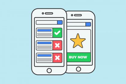
When it comes to website design, navigation is at the top of our priority list, and it should be for you too. I mean, after all, it’s what’s between your user and their end goal. Essentially, website navigation is the deciding factor in whether a user will continue to use your website.
Today, we will discuss the key factors that make for good website navigation and, ultimately, a pleasant user experience. But first, let’s talk about what website navigation is.
WHAT IS WEBSITE NAVIGATION?
Website navigation is the collection of user interface components that guide users to find your website’s content and features. The components can take the form of things like link text, copy, menus, and buttons.
HOW DOES WEBSITE NAVIGATION AFFECT USER EXPERIENCE?
Numerous factors influence a website’s user experience. The end-user experience is influenced by font, color, images, headlines, calls-to-action, website load time, and form design. The most critical consideration, though, is navigation. If visitors can’t find what they’re looking for within your website’s structure, they’ll likely leave and look for the same content elsewhere.
For example, suppose you run an eCommerce website selling shoes. In that case, a frustrating navigation experience will more than likely cause your potential customers to abandon your website and go to one of your competitors’ websites instead. Not only is that a lost sale, but also that user probably won’t be coming back to your website the next time they want a pair of shoes.
WHAT MAKES GOOD WEBSITE NAVIGATION?
Now that you understand the importance of good website navigation, let’s explore some key factors that can make for a good website navigation experience.
Simple Navigation Bars
Website navigation bars have a history of having either too many or too few links; it’s critical to establish the correct balance. When developing your own navigation, you may find it helpful to consider the following two questions:
- What do you want your visitors to do when they come to your website?
- What do your visitors want to do on your website?
The distinction between a user’s goals and your own is critical. For example, while your visitors may be interested in learning more about your company’s history, you’ll have your own objectives in mind, such as enticing people to visit product pages or sign up for accounts.
If you think your website is guilty of having a cluttered navigation bar, you must consider organizing your website better. You can create a simple navigation bar by using a main heading then a sub-menu that includes links below it.
The most important thing when creating a navigation bar is to focus on serving your users’ goals.
User-friendly Language
When designing the labels/UX copy for your navigation elements, you need to keep in mind that clarity is key. You want your users to be able to immediately understand what they are about to click on or what content they are currently browsing; there should never be any confusion, ever. Confusing labels can send your user on a mission to find a component that should be easily discoverable. And if a user thinks they are putting too much effort into finding something, there is a very high chance they will leave your website, never returning.
So what does user-friendly language look like? Here are some examples:
- On a label for a page with your company’s contact information, you will want to say “Contact us” instead of something like “Leave us a message.”
- For a label for a page that contains information about your employees, you might consider saying “About our team” instead of “Who we are.”
Follow Web Conventions
Designing with conventions in mind is crucial for making sure human and non-human web crawlers can access every page of your website. Conventions are based on ideas that work and make it easy for the everyday user to go from one page of your website to the next without struggling to find their desired content.
Web conventions exist for a reason: they’re founded on concepts that work and that most web users understand. In many cases, these standards are so well-established that most individuals will be able to navigate websites in entirely different languages simply because the functionalities are placed in intuitive locations.
Include a Footer
Ever visit a website and don’t find what you’re looking for, so you decide to scroll down a bit. Then a bit more. Still, you don’t find what you’re looking for, so you scroll a bit more. And then finally, the link you were looking for appears in the footer!
This is a pretty common experience for anyone who browses the web. Everyday website footers are saving a website’s bounce rate. The footer acts almost like a safety net, catching users before they hit the bottom of the page left in frustration.
Often overlooked, footers are a crucial function of your website’s navigation experience.
Not only do they help users find information when they don’t know where to look, but also they also encourage further exploration. Once a user reaches the end of a page, their experience with your website doesn’t have to end there. A footer allows users to further their exploration and interact even more with your website by providing other engaging links.
We all know that today, mobile experiences are more important than ever before. With a smaller screen comes longer scrolling times. When users get lost on a long page, they can always go to the bottom to find an easy navigation option waiting for them.
CREATING USER-FOCUSED WEBSITE NAVIGATION
It’s not easy – but it’s not impossible – to create a navigation system that’s intuitive and understandable to the majority of your users. Understanding how your users think is the first step on the route to designing such navigation. Or, to be more specific, how your users think your website’s content should be organized.
At New Target, we use a method called card sorting. Card sorting helps us design or evaluate the information architecture of your website. Information architecture basically focuses on organizing, structuring, and labeling content in the most effective way to help users find the content they are looking for and complete their desired task.
When we conduct a card sorting session, we ask our participants to organize a set of topics into categories that make the most sense to them. Often this also helps us with labeling these groups.
Helping users navigate websites should be a top priority for every company, and it definitely is for us at New Target. We design websites with navigation elements that put users first. The navigation we design feels almost invisible, guiding your visitors seamlessly along their user journey. Contact us today!
A global team of digerati with offices in Washington, D.C. and Southern California, we provide digital marketing, web design, and creative for brands you know and nonprofits you love.
Follow us to receive the latest digital insights:
- 4 min read
AI is changing everything it seems. Will website accessibility be any different? In the olden days (read: a year ago), a manual review of your website would have taken the...
- 5 min read
Managed Hosting Is a Strategic Investment Significant time and money is spent on a new website. There is a keen focus on overall strategy: the content and design, accessibility, and...
- 5 min read
Interactive Design Helps Manage Information Does your website work like a grocery store where all the cereal, milk, bread, coffee, and mini-cupcakes you are looking for are there but packed...
- 6 min read
Governance Matters Who should organizations blame when publishing becomes slow? It’s usually the website platform. The content is stuck waiting for approvals. All the departments struggle to update their information,...